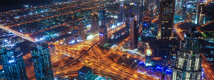
Fat cats and fossil fuel companies: who’s to blame for climate change?
We all know that some people drive climate change more than others. It’s no surprise to anyone that the wealthiest produce more emissions than the poorest, and that the poorest suffer more from climate change than the richest. It may be a surprise to many people to find out just how great the disparity is – but it may also be a surprise to find that the role of inequity in climate change is more complicated than we might think. Head of Campaigns and Communications Alistair Currie looks at the numbers.

This is a long article, so we’ll summarise it here:
- There is extreme and indefensible inequality in carbon emissions, with the richest producing vastly more than the poorest.
- The richest 10% of people globally, however, are not all rich by Global North standards – some people on average incomes in their countries fall into that bracket.
- People in the “bottom 90%” still produce about half of all emissions, so have a very significant impact on climate change.
- More and more people are escaping poverty, but as they do so, their emissions go up.
- Population growth is highest in the lowest income group, who contribute least to climate emissions, but that is unimportant to climate change only if they remain poor.
- Major studies on inequality don’t account for all factors contributing to climate change
- Fossil fuel companies are responsible for exacerbating the climate crisis in multiple ways, but it isn’t accurate or useful to hold them accountable for the majority of emissions.
- It’s essential to address inequality if we’re to control climate change, but that isn’t all that’s needed.
- Positive, empowering solutions which help to reduce population growth will improve lives and play a vital part in achieving climate justice.
The shocking reality
In 2015, Oxfam conducted a study to assess just who was driving climate change. In 2020, in collaboration with the Stockholm Environment Institute, they conducted another, examining how different global income bands had driven climate change between 1990 and 2015. Their findings were shocking, and widely reported. Here’s just a small selection.
- The world’s richest 1% of people produce more emissions than the 50% of people on the lowest incomes
- The world’s richest 10% accounted for just over half of the emissions added to the atmosphere between 1990 and 2015
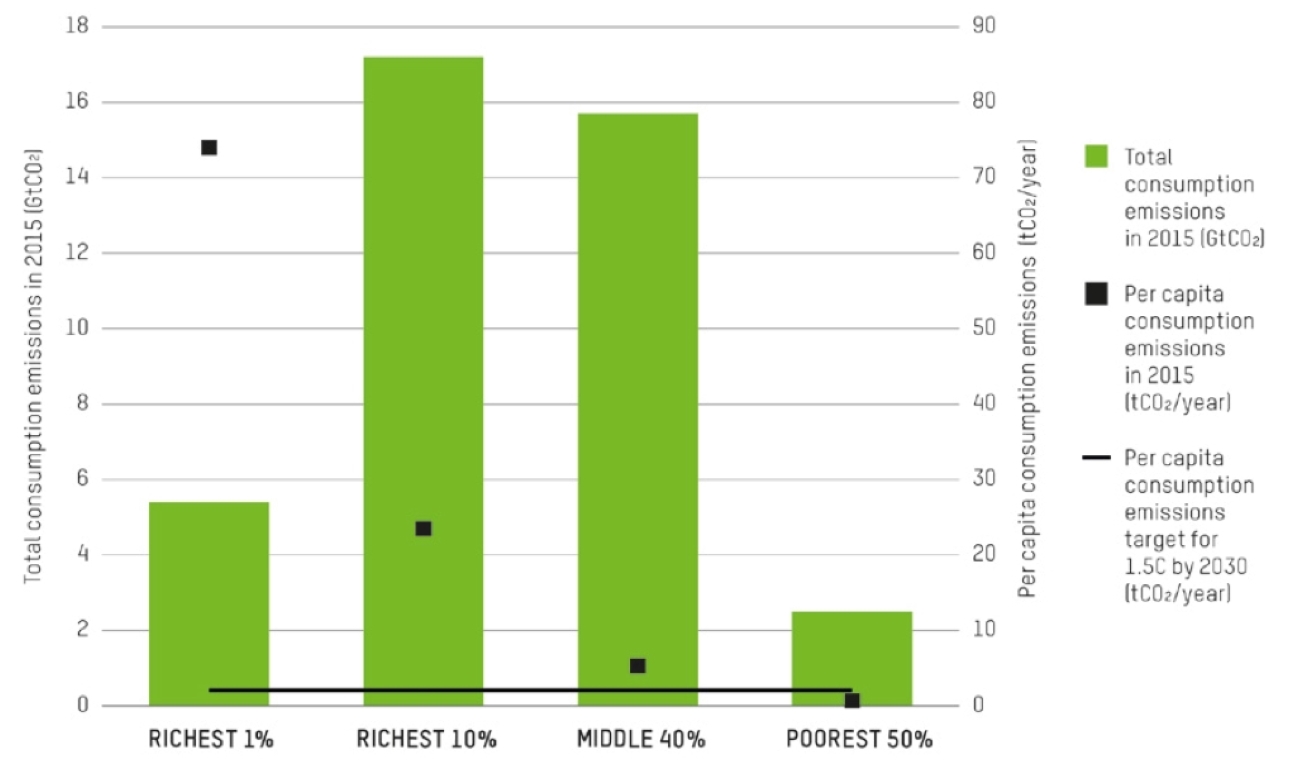
- The per capita emissions of the richest 10 percent will need to be around 10 times lower by 2030 to keep the world on track for just 1.5C of warming – this is equivalent to cutting global annual emissions by a third. Even reducing the per capita emissions of the richest 10 percent to the EU average would cut annual emissions by over a quarter.
- The average emissions of the richest 10% of Indians is just one-quarter of the poorest half of the US population, while average emissions of the poorest half of the Indian population is just one-twentieth that of even the poorest half of the population in the US.
Such figures tell us that our global economic system is profoundly dysfunctional, and that climate change represents its injustices in the starkest terms. These figures are even more damning when you realise that a country’s vulnerability to climate change maps very closely to its degree of poverty. As the studies rightly argue, the richest have driven climate change at the expense of the poorest, and have the responsibility to pay for fixing it.
Share of emissions is not the whole story
The purpose of these studies was to expose grotesque inequity – and they did so very effectively. That has led some people to conclude, however, that inequity is the principal driver of climate change, and if we tackle inequity, we don’t only create a more just world, we fix our planet. Are things so simple?
Here’s where it’s worth unpacking the figures a bit – and wherever we don’t indicate another source, all the numbers below come from the two studies.
Oxfam (for ease we’ll just refer to these as Oxfam studies) identified four different income categories: the highest earning 1% of the global population; the highest earning 10%; the next 40% (the “middle” group); and the remaining 50%, the “bottom half”.
Looking at actual emissions of each group, as opposed to the proportion of emissions, tells a story a little different to the headline figures. The contributions of each group between 1990 and 2015 were as follows:
- Top 1% were responsible for 15% of emissions
- Top 10% for 52% (37% if you remove the 1%)
- Middle 40% for 41%
- Bottom 50% for 7%
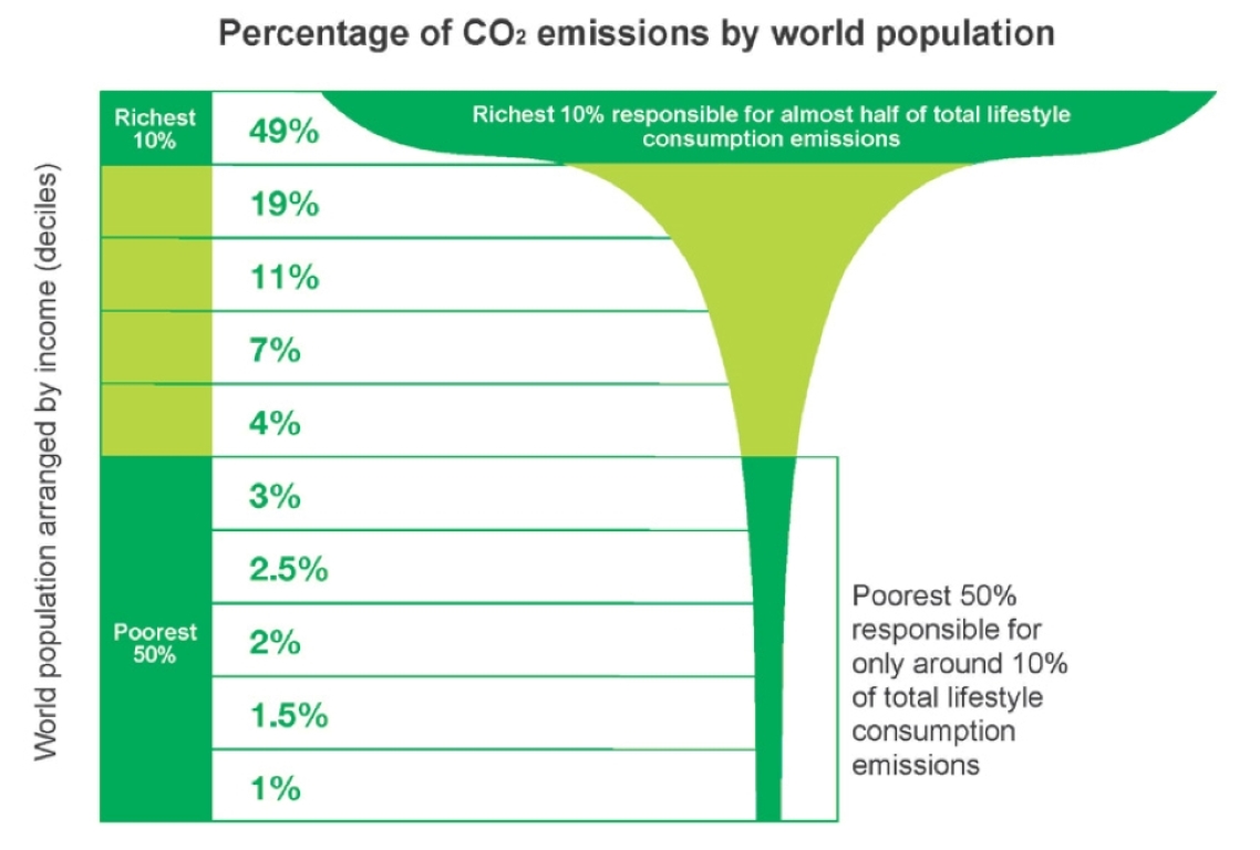
[Note, these graphs relate to emissions in 2015, so their figures are slightly different to the cumulative figures quoted above.]
So the first thing we learn is that although the bottom 50% have a negligible impact on emissions, the top 1% are responsible for just a sixth of emissions – grossly disproportionate, but not the primary driver of climate change. The biggest single contribution was by the top 10%, but even the middle income group produced more than twice as much as the 1%.
Of course, within each of these groups, the people towards the top end contributed most, but it’s also very important to understand exactly what those income bands actually are. While we might have a picture in our heads of the top 1% flying private jets and the middle 40% commuting in their second-hand cars, we’d be hugely underestimating just how poor the bottom 50% are. The income bands for these categories (2015 figures) are:
- Top 1% – more than US$109,000
- Top 10% – more than $38,000
- Middle 40% – $6,000-38,000
- Bottom 50%, under $6,000
The average UK annual salary in 2015 was £27,615 (today just over £31,000), equivalent at that time to US$42,000. In other words, the top 10% of people globally was anyone earning more than the UK average – even some people earning less. It’s likely that many, perhaps most, people reading this blog will find themselves in that top 10%, or near it. And while the 1% may be a powerfully resonant figure, very few are in the Rolls Royce league – just triple the average UK salary puts you there. Doing very nicely, but scarcely a character from Succession.
And when we look at the band below that 10%, we realise something pretty shocking: if you earn more than $6,000 dollars a year, you are in the top income half of everyone in the world. And yet that band of people who would only appear rich to someone living in desperate poverty, drove 40% of emissions between 1990 and 2015.
Please sign up below for our monthly newsletter to find out more.
Meeting our needs
That should really come as no surprise. Everyone needs food and water, and everyone above subsistence level also uses and benefits from energy and infrastructure (agriculture and corresponding change in land use is responsible for more than a sixth of emissions alone). Even the lowest income category of all were still responsible for 7% of emissions. Living even the most meagre existence generates some carbon emissions. It isn’t that the number of poor people has no impact on emissions – it’s that the poorest people have almost no impact.
Other figures from the report bear out the impact of the majority. Annual emissions grew by 60% between 1990 and 2015. The top 5% were responsible for about a third of that growth (37%) – that’s shocking and indefensible, but it also means two-thirds came from the rest of us.
Whose emissions?
It’s also worth considering what these emissions actually mean. Both studies refer to what are generally called “household” emissions. This means not simply what a household “produces” through direct energy use, but the carbon emissions resulting from the consumption of individuals. So, for instance, the carbon emissions generated in making the cars we buy are included, not just the emissions they produce when we own them. (Similarly, it’s most useful and fair when looking at the carbon emissions of countries to use “consumption” emissions, which reflect emissions from goods imported into the country, rather than “territorial” emissions, which are just those generated within the country itself. That’s what PM does.)
It’s generally accepted (and is the principle the studies work on) that about two-thirds of emissions are attributable ultimately to household consumption, with the rest expended by governments or on capital investments.
The first of the two Oxfam studies does not factor in this third of emissions at all. In other words, when it says 1% or 40% of people are responsible for a certain proportion of emissions, it means they are responsible for that proportion of two-thirds of all carbon emissions, not the total. That calculation, for instance, adjusts the contribution of the richest 1% to a tenth of all emissions, rather than a sixth.
The 2020 study, looking at growth in emissions over 25 years, took a different approach. It did include government and capital expenditure, working on the principle that overall the advantages of such spending matches household emissions in the same proportions. But does it?
When governments build railways, hospitals or schools, those services aren’t disproportionately serving the 1% – to put it another way, the mileage of roads we build is influenced far more by the number of Ford Fiestas than the number of Rolls-Royces. Similarly, the number of tanks or aircraft carriers a government buys and maintains is not really a reflection of its proportions of rich and poor people. India, for instance, spends more than twice as much of its GDP on defence than Japan. In general, the richest may well benefit more from feeling more secure from attack or get a bigger share of the profits from capital expenditure, but the assumption used here is a big one, and important to bear in mind.
On methodology, there is another factor. The studies look only at emissions – not the other side of the climate change equation, the capacity of the Earth to absorb emissions, through carbon sinks. When we picture rainforest being torn down for cattle grazing or palm oil monocultures, we’re not looking at products which serve the very richest. Even the fattest of fat cats can only eat so much.
That’s not to let the fat cats off the hook. They can, and do, contribute disproportionately to emissions by, for instance, investing in (or owning) companies putting profit before planet – including those which are destroying natural habitats to grow food.
What is driving emissions?
The IPCC’s 2022 Mitigation of climate change report states:
“Globally, Gross Domestic Product (GDP) per capita and population growth remained the strongest drivers of CO2 emissions from fossil fuel combustion in the last decade.”
This is no surprise. Broadly, emissions are determined by level of economic activity, relating to consumption, and the level and mix of fossil fuels in the production of energy. (Coal –as still used heavily in India and China, for instance – is a dirty fuel that will generate twice the CO2 of natural gas.)
As long as our economic activity remains primarily driven by fossil fuels, the critical factor in driving emissions is how much stuff we produce and consume. And how much of that there is depends on how many of us there are, how rich we are and how we choose to spend our money.
As we’ve already seen, half of us are very poor – more than half, because people in the bottom part of the “middle” 40% are not wealthy by anyone’s standards. Not only do poorer people consume little and produce little, they have fewer options when it comes to how they spend their money. An average person in Uganda will spend almost half their income on food – an average person in the UK a little over 20%. Europe’s richest 1%, meanwhile, spend less than 5% of their income on food. As the Oxfam studies note, a third of their emissions come from air travel alone. The richer you are, the more options you have in how much to consume and the easier it is to cut your emissions.
Why population matters
But, unsurprisingly, the more people there are with more income, the more our emissions go up. And more and more people are escaping poverty and becoming richer.
According to the study, in 1990, the total carbon emissions of the middle 40% were 9.2 Gigatonnes (GtCO2) and in 2015, 15.7 GtCO2 – an increase of 70%. Over that period, the actual income ranges of people in that bracket increased from $2,000-27,000 in 1990 to $6,000-38,000 in 2015. Those people had more money and unsurprisingly, on average each produced more carbon by the end of that period, with per capita emissions rising from 4.4 tonnes (tCO2) to 5.3, an increase of a fifth.
Where we see a bigger increase, however, is not the emissions individuals produce but the number of individuals. In 1990, there were 2.1 billion people in the middle 40%; in 2015 very nearly 3 billion, an increase of 40%. In other words, while the relationship is complicated, the number of people in this income range appears to have driven the increase in total emissions more than their greater affluence.
There’s very good news there – more people escaping poverty and gaining greater economic security and opportunity. But the picture isn’t all rosy. For the poorest 50% of people, per capita emissions rose by just 1.5%, reflecting minimal extra income, but their total emissions rose by 39%. Why? Because their numbers rose by more than a third from 2.65 billion in 1990 to 3.62 billion in 2015. People at the bottom aren’t getting much richer, and there are far more of them. While those numbers are, again, an indictment of an economic system that serves to make the rich richer rather than the poor less poor, we know that what’s driving that increase in numbers is population growth, which is closely linked to and driven by poverty.
Economic justice and climate justice
Here is our conundrum. People have an absolute right to escape poverty and lead decent lives on decent incomes. When they do that, their emissions go up. How little they currently contribute and have contributed to climate change doesn’t tell us how to fix it. The number of poor people only doesn’t matter if they stay poor. Allowing that to happen would be barbaric.
In fact, a newly published study in Nature Sustainability takes a more granular look at carbon inequality across regions and countries, using a different methodology (it is based on 2014 figures, as these are the last comprehensive data available). Its results are very similar to the Oxfam studies, and confirm the extent of carbon inequality – showing, for instance, that the average carbon footprint in the top 1% is more than 75 times higher than that in the bottom 50%.
The new study concludes that moving people out of extreme poverty (using the internationally accepted World Bank definition of living on $1.90 per day) would add only 1% to carbon emissions. However, it also found that bringing everyone not just out of extreme poverty but above the World Bank’s international “poverty line” of US$5.50 a day would increase carbon emissions by nearly a fifth – a potentially major obstacle to hitting net zero. That is just bringing people above the poverty line. Providing better lives than that will mean even more climate change impact.
These studies tell us we can slash emissions if the richest live on very much less – but note that figure in the bullet points above: the per capita emissions of the richest 10 percent will need to be around ten times lower by 2030 to keep the world on track for just 1.5C of warming. That, broadly speaking, means you and me. We can rightfully blame the richest for driving climate change, but blame only takes us so far in identifying solutions.
Climate change isn’t just about numbers and wealth, of course. If we can, as we must, eliminate fossil fuel use as much and as soon as possible, the number of us and the amount we consume will be less important. But we’re looking at a series of ifs here. However much we may want and fight for it to be otherwise, we all know that the chance of a massive cut in carbon emissions through plunging consumption and transition from fossil fuels faces massive obstacles, and no one should take a bet on it happening soon.
Meanwhile, the UN currently projects just under two billion more people by 2050. Most of that growth will occur in the poorest places, and often the most vulnerable to climate change. If we want more people to live better lives with more choices, our numbers matter.
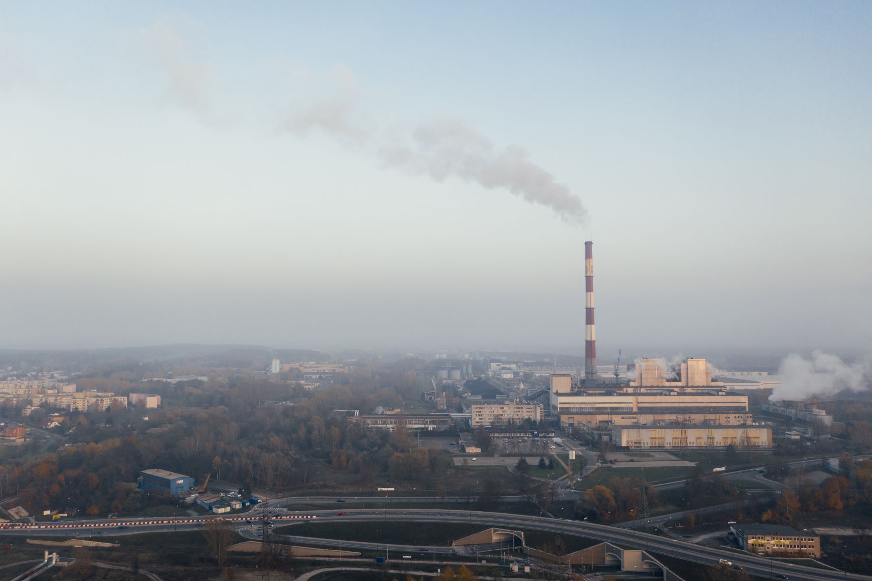
Blaming the fossil fuel companies
While we’re looking at how original research is sometimes misunderstood, there is another widely quoted example we should consider – the claim that 100 companies are responsible for 71% of emissions.*
The claim is made on the basis of the Carbon Majors Report 2017, published by the Carbon Disclosure Project. This impressive and authoritative piece of research assembled evidence and data showing the total emissions associated with fossil fuel companies between 1988 and 2015. It reported two kinds of emissions: those caused directly by the companies in the course of their work extracting, selling and distributing fossil fuels (what the report called Scope 1 emissions), and those produced by the use of their commodities once the companies had sold them on (Scope 3). 90% of those emissions were Scope 3 – in other words, these companies were “responsible” for 71% of emissions only if they were held responsible for what others did with the products they sold.
And who is the end-user driving that demand? Well, ultimately, us. Consumers buying the products that were manufactured using fossil fuel energy, or poured into the petrol tanks of the cars we drive or the planes we fly in. Of course, as the carbon inequality report shows so effectively, we’re not all using them in equal proportions, and billions of us are hardly using them at all. But companies don’t sell what people don’t buy. It is of limited use to ascribe emissions generated by consumers to companies who supply one of the raw materials used in producing what those consumers buy. The driver here isn’t supply – it’s demand.
Nor are all these companies the kind that people might imagine, run by cigar-chomping capitalists flying their private jets to the cup games of their football teams – in fact eight of the ten companies with the greatest emissions are state-owned. In both Scope 1 and Scope 3, number one emitter China (Coal) is responsible for more than the four highest-ranked private companies – Exxon, BP, Shell and Chevron – put together.
None of this is to paint fossil fuel companies as our humble servants just innocently meeting our needs. They are guilty of clinging on to the profitability of fossil fuels while neglecting investment in clean technologies, or even suppressing their use. Fossil fuel companies have intentionally cast doubt on the science of climate change, and use their leverage with governments to extract massive subsidies and obstruct legislation. They have every interest in marketing their deadly products to us and promoting the hyper-consumption which is unbalancing our climate. Let’s be sure though, to blame them – and seek change – for what they are responsible for, not what they aren’t.
Because the major impact of fossil fuel companies is meeting our demands, the 100 companies/71% figure is not all that useful in solving our problems. If we shut down those companies, others would step in to supply our needs: taxing them more heavily seems just, and could bring many benefits, but risks the costs being passed on to consumers. As one of the world’s leading authorities on inequality, Thomas Piketty, has noted, that may even exacerbate inequality, because the effects would be disproportionate on people on lower incomes. The answers aren’t simple.
Inequality, carbon emissions and the future
What do all these studies tell us? The first and most important message is that we live in a deeply unequal and unjust world, where the actions of a tiny minority can lead to great harm to billions of people who contribute next to nothing to climate change. They tell us that our prevailing economic system is not serving the needs of most people, giving to those who have most and taking away from those who have least. They tell us we need to change that.
They tell us that addressing the consumption and emissions of those who benefit most from our unjust economic system is essential if we’re to fix climate change. What they don’t tell us is that all we need to do is punish the rich to solve climate change. In fact, they tell us that many of us are the rich and we need to live with much less if we’re going to have a hope of securing our future. They tell us too that numbers of all of us matter – even the numbers of those who have so far contributed least to climate change and look set to suffer its effects most.
Ultimately, what these studies tell us is what we should all know: climate change is messy and complicated, and it isn’t simply a space in which white hats and black hats are set against one another in an epic moral struggle. They tell us that apportioning blame is not as useful as identifying what will work in the future – and that identifying the role and importance of the 99% is not letting the 1% off the hook or blaming anyone.
In this long post, we haven’t looked at how population interacts with climate change, and the compelling evidence of how positive, empowering solutions which improve people’s lives and give them choice can help us tackle it. We discuss these at length in the links below and please explore the issues further.
Here’s what we know: tackling inequality, cutting the consumption of the affluent and slashing the consumption of the richest, protecting carbon sinks, and keeping fossil fuels in the ground are essential if we’re to tackle climate change. So too is taking the actions which end our population growth. Even better, unlike many of the other solutions, those solutions aren’t hard to implement. They’re what people want.
* We’re very indebted to Lloyd Alter for his insightful analysis of the 100 companies claim on Treehugger. Thanks also to David Samways and Andrew Howard for checking calculations and commenting on early drafts.